
Monday, 8 March 2010
Untouchable: Final Cut Version
This version of the trailer was changed to solve some minor issues that were seen in the original cut. The following things were changed.
-The motion of the head colliding with the wall has shown more of the travel distance
-The 'In a basement near you' was moved to after the blood dripping on the floor
-At the end the mask and the bad tv effect is a lot shorter to show less of the face
Thursday, 25 February 2010
How did you use new media technologies in the construction and research, planning and evaluation stages?

Google Images- Google images was used in terms of research for both the main teaser trailer product for stills from existing horror trailers and for the ancillary texts for pictures of existing magazines. Searching for pictures is fast and efficient as well as you can save any image you find in order to make it much easier on us so we can always look at a design or existing product we liked all the time.
Youtube- Youtube was used in my research to look at existing teaser trailers in order to see how they were filmed and made to look like. We spent a lot of time analyzing many theatrical and teaser horror trailers in order to come up with a way in which our groups product would actually look like. It was always used in terms of research for shots, angles and styles of music to be placed into the trailer and was very useful.
For Construction I used the following:
Camcorder- The camcorder is the most important piece of equipment used for the actual production for the movie, without it the project couldn't be done. We had to film it in a 4:3 ratio as some camcorders didn't all have the 16:9 widescreen ratio. We used tapes for the recordings and the camcorder allowed us to film the whole thing in no time as well as experiment with some of the features like backlight and night vision etc when we were on dark sets.
Camera- A camera was used to gather pictures in order to complete the ancillary tasks (Poster/Magazine) it wasn't as used as a camcorder but it was required to get the texts done. We only used it on odd occasions towards the end of trailer production, when we were filming we found a shot that we thought would look good for a poster so we would take a picture with the camera (so being resourceful). There were many functions or settings we had changed to get different shots including shutter speeds and even using the tripod to get some still shots which were straight or canted.
Tripod- A tripod was used in order to get some still camcorder work and also for some still close ups for our picture taking. It is a very useful piece of equipment which is ideal for getting nice steady shots or photos compared to the human hand. It is basically a necessity when it comes to filming because you never know if there is a shot you may want still.
Final Cut Pro- This is the editing software we used (which was only on the college Macs) it is a professional editing suite that even today film developers use. We took a while to get used to how it worked and for me myself I used different editing softwares which made it tricky for me to, but it was apart of a learning experience. Final Cut Pro gave us so many different ideas to do and the functionality and compatibility with other Mac software was great (It allowed us to create some odd tunes in garage band and import them in, also the 'live type' for inter-titles was compatible as well which made the product look much more original and professional). During the editing stage we were able to accurately cut clips down to size which is something I haven't properly experienced with other editing suites.
The massive library containing hundreds of effects to use on the product including the one we used at the end called 'Bad Tv' aren't just effects but fully customizable which gives so much depth to the product. Cross fades were the most common throughout the trailer and the importing of existing tunes we found made this project easy to do. But the most handy of features is the log and capture function allowing you to plug in a tape camcorder and for it to capture any selected clips you say and save them into the library. This was a very useful tool and did not waste time at all which gave us more time for other parts of the trailer.
Creative Commons Sound Sites- These websites allowed us to search and download freely via creative commons rights. The ability to find a soundtrack or sounds that we believed to be suitable for use in the teaser trailers background. Without music/sounds there would be no interest in the trailer. Finding the music for the actual trailer took a long time it was really a process of trial and error in terms of finding a song or tune that would deliver the horror punch we needed. In the end we came to a conclusion of a classical piano horror theme which in the end came out very effectively. Odd sound effects like the bang or boom if you call it were found on there as well as a means of tension.
Adobe Photoshop- Photoshop allows us to create our ancillary tasks (Poster/Magazine) with ease and gives us a more in depth software package to allow our imaginations run wild, the only thing preventing us making something looking great is our imagination. Photoshop is something that is required if you want to get a professional look to the overall text products whether its simple font (or even very complex fonts using effects such as glows etc and different writing styles) effects (shapes, gradients, lines, paintbrush etc) or image manipulation it is the software which most businesses use. Photoshop allowed us to create absolute anything we wanted, and we had the help of online tutorials or help from the teacher in case we got stuck, but as you can do so much with it, it was kind of needed in some cases and well we always asked for feedback on it before we changed the product again.
Planning/Evaluation/Research Info etc:
Blogger- Blogger being an online blog site gave us the chance to make a blog which held all the information of our research (Screenshots, trailer links, storyboard screens etc) it allowed us to post our finished content as well as making it very easy to read our written research and essays regarding other horror movies. Blogger is very efficient to use and is less time consuming then physically writing it all out, with the idea of picture upload into the essays, hyperlinks, videos etc it becomes a more interactive experience. As well as being simple to use it was also easy to find the work we done by the idea of labeling which made it much easier to find work which would be much harder with paperwork.
Flickr- Flickr is a website that is used for annotating stills/pictures you upload and is quick and easy to use.We used this website alongside blogger which we used as a place to look at images we have collected and annotated regarding key conventions of the horror genre, it wasn't overly used but if people were to use it, it gets your work going a lot more quicker and saves space, another brilliant feature is to merge it with blog sites and blogger is one of them, when uploading a picture to flickr and posting it, it would automatically place it onto your blog site.
Youtube- Youtube again was used for the final part of which being uploaded to the rest of the video world, this way we were able to show people we knew and ask for feedback on how our teaser trailer looks etc. We had two versions of our product on youtube in the end, the normal version and the final cut version which was altered from the audience feedback we had got. Youtube allowed us to show the internet our work and hopefully get some comments or feedback regarding it.
What have your learnt from your audience feedback?
We had a screening in front of our target audience which were in our target of the 16-24 years of age group (They were around 17-18), we showed them our teaser trailer in return for audience feedback on what our teaser done good and what it done bad at to help us improve or take into consideration for upcoming trailers that could appear.
Music/Sound:
-The music was very good and provided a lot of suspense (Negative comment by another regarding a lack of tension in the music but a good use of bangs to make it more gripping)
-It was a slightly different approach with the music it aimed at a more classical tone to horror and it was executed very well.
-One problem that was noticed was a jump in the music during the beginning of the dragging scene it starts quiet and then jumps to louder as the track was meant to be.
-A personality can be shown by the music a calm and orchestral piece could suggest this is what the killers theme is like meaning he is fine when doing the killings.
Cinematography/Editing:
-Canted camera angles throughout the trailer, as it is meant to portray the view of the killer it shows a more uneasy twisted approach to the audience.
-The shots from the beginning were good at establishing a setting and what the main focus is throughout the trailer.
-The editing construction worked well and the special effects complimented it.
-It needed more pace towards the end maybe a few more shots and then cut through them at a fast rate to give a more tension feel.
Mise en scene:
-The costumes were very well done, they look good and give the characters their personality and class.
-The locations are very well captured and shown well with the lighting to aid them.
Other feedback:
- The voice over was very well done and compliments the trailer well and gives a sense of narrative structure but enough to make you want to know more.
-Regarding the voice over, they feel that the laughing can come across as more of a cheesy laugh rather then a twisted one. It should be more paranoid by the killers voice, this would bring more unease to the trailer.
- A shot at the end showing me alive again for the actual ending but laying on the floor dead/unconscious before hand could be a wrong way of putting it, but the ending had the finishing touch to that of the trailer.
-It can lead away from slasher horror and go into the area of horror/thriller with its feel for cops and victims this was mentioned twice but as of modern movies not all stick to a specific genre but lead into others even if its a minor showing.
- The idea of leading away from the traditional final girl which can be linked in with the slasher horrors which could further link it as a cross genre but still lie with horror at its core.
In all from what can be read, I think what I have learnt is that we delivered a trailer that had a good use of camera angles (canted, close ups etc) a strong soundtrack to put a classical twist on it, overall I was pleased with the outcome of the product. Though we did get mainly positive comments we did get the odd negative comment, this was in regards to some odd pacing issues. Due to a change in story-line time after time it left us very little time on the finished idea, so if we had a week more on the project I think some things like the pacing and some music that cuts in differently would of changed. Some more scenes containing more gore could of been applied to keep it showing it is a standalone horror movie rather then a hybrid of a horror/thriller. I would of liked some more torture shots in and maybe a change of opening music (I didn't feel that it had quite the punch it needed to take the audience in) and a slightly different opening to bring in a more clearer narrative (The work place shot was slightly poor in terms of the lighting outside ruining the shot so you can't see through the window at the victim) .
I believe that all the feedback we got from our audience proved crucial to our way of thinking if we had the extra time to make amends on the teaser trailer. In the final cut version we only changed parts which some feedback suggested like fonts and sound cuts etc to give it that extra layer of polish. But as stated above some additional stuff I would of placed in to make the product feel complete. I still think we delivered a good product in the end and the feedback provided by the audience was very good and very constructive in helping us solve issues within the teaser.
I believe that all the feedback we got from our audience proved crucial to our way of thinking if we had the extra time to make amends on the teaser trailer. In the final cut version we only changed parts which some feedback suggested like fonts and sound cuts etc to give it that extra layer of polish. But as stated above some additional stuff I would of placed in to make the product feel complete. I still think we delivered a good product in the end and the feedback provided by the audience was very good and very constructive in helping us solve issues within the teaser.
How effective is the combination of your main product and ancillary texts?
As a whole I believe that from a promotional standpoint that all three of my products tease audiences with my horror movie 'Untouchable'. From my poster I believe it shows a professional poster feel to it. It establishes the genre of the movie, the production values (Directors/Producers etc all in the strapline), the theme of the movie and a strong tagline which was not featured in the trailer because of time problems with the group, but what I came up with is something that I believe would be ideal to that of the concept to the movie. The tag-line itself delivers that needed scare in order to entice my audience and draw them in. From a marketing point an effective way of delivering the sense of horror to the poster is by incorporating some of the key elements of the genre and the style of the movie. I think the audience will see that this is a horror by the distinct blood red color writing and the use of shadows and blackness for the background. The pictures deliver a sense of unease as the faces show no emotion which can go in benefit to the overall effect. The poster is ideal in terms of teasing the audience as well as hiding any key plot driven elements so that the target audience will go and see this movie.
The actual teser trailer provided a paced and mysterious style to it which accompied by my audience feedback successful got them teased to see more. The teaser itself does a good job at providing the theme and genre of the upcoming movie as well as showing how serious it is in terms of stunts and blood. It features a similar dark atmosphere that is carried over with the poster. The teaser also shows many things that have been incoporated into the magazine/poster. The dark eery atmosphere shows us a more demented world and the fact of low key lighting putting a bigger scare in the trailer and poster. The mask makes an appearence throughout the trailer and is in all 3 materails. The idea behind this is for us to associate it with horror and to show who the audience should believe what the killer looks like.
The most appealing thing about the teaser trailer is its soundtrack which took a while to conjure up, I hope if people where to watch it listen to it carefully, it starts a bit up beat then eases its way into a more classical feel which is more of a classical horror and what my group had intended to portray is the killers insanity with such calm music while he kills people. We think it adds more depth and personality to his character and it could make the audience feel somewhat threatened.
-2.jpg)

The movie magazine however provides a more suspicious view on the killer but also brings in a horror feel with bold red fonts and clear gradient standing title fonts which is a style I carried over with my horror movie poster. I still used images showing that of the masked killer, but this one I done differently to the others (Poster and the concept in the film) where the lighting around the killer wen the pose is shown i much brighter then that of the poster and the killers entire feature throughout the trailer. In the other products I made a dark evil sort of approach to them both and with the magazine I wanted to make the public who see this (who have maybe seen the poster etc) would be caught by it. It would catch their attention cause I am showing a possible lighter side to the killer which could make for a gripping cover.
I took a similar approach to existing horror movie releases and their products I made sure to stick with the one thing that is going to make it eye catching and enticing which is the masked killer in this case. By a teaser/poster/magazine covers you are shown different parts of the killer from his sick personality to his brutality etc, and that is the main focus point for the teaser trailer. We want the audience to understand his character and identify with him with what he does for a living. Some things are hidden from the audience, who the killer actually is, why does he kill, what grudge is their to have against the innocent people.
To promote all of my products I would use the concept of making toys and collectables to appeal to the mass audience and bring in extra revenue. Original Soundtracks from the movie as well as any other tie in merchandising would be crucial in order to gather an audience and help sell the movie without relying on the poster and trailer as a whole.
Publicity is another way of trying to promote the movie, this could be done by interviews with fellow cast/directors or crew. It would give an insight to the overall movie as well as snippets of footage or teases to help drive the audience to see the movie. Newspapers and press need to be established and with interviews can gain publicity through the headlines and through magazine/paper previews etc. Screenshots of production or the actual movie stills would be another thing the marketing company would consider in terms of capturing their audience.
The distributors plan to releasing a movie around the summer period would be ideal, for investment because of the summer holiday period. This will allow them to gain a higher profit because of more viewings, and the age certification would be a 15 which when taking the summer period into the concept this would be ideal for gaining the extra viewings. As the target audience is around 16-24 this would come across a lot more age groups as it being a 15, the more people the better in terms of profit. With the bonus of the summer occasion the more people will end up going to see the movie and this all relies on an effective marketing plan with the teaser trailer and poster.
In all I think all three products give the audience enough information but not to much information on the genre, theme, characters, production values etc and establish a very professional look and will tease the audience enough to want to see the movie as well as read the magazine regarding it.
In what ways does your media product use, develop or challange forms and conventions of real media life products?


The stills on the left are from our teaser, and those on the right are from professional teaser trailers.
1)In the picture we can see some conventions of horror, we see bright white lights that are meant in this case to portray a sense of freedom to the victims in the room. It is of course motivated lighting and is of a low angle this can suggest the victims being weak and helpless, I believe that most horror films if a light source is shown it shows the last remaining life they have.
1)In our shot which is similar in most ways, we wanted to portray the fact that this is the victims life and its slowly fading (the light actually turns off) and compared to the original ares is more darker to show a sense of more danger and getting to freedom is far more challenging.
2)In this picture we can see some feet being dragged away which is very typical of the horror genre, you have a mysterious killer dragging away someone's corpse, low angle shot with low key lighting which is as well common to be seen in the horror genre
2)In our shot it is slightly different, we wanted to show a higher anger to show more power towards the mystery killer and it makes the victim more weaker as well as being dragged down the stairs. The lighting is darker and towards the bottom which we wanted to make the audience feel that, that is where he will never escape from. There is a black and white feel to it which we wanted to make it distinguish what parts of the movie are the killers to that of the victims whose remained in colour.
3)In this shot we can see a dark forrest with a masked killer chasing a young female (typical horror/final girl? etc) and with a blunt weapon which will most probably be the weapon of choice throughout the killings. There is some lighting going on the killers face but he still remains a mystery and a low camera angle makes him feel more powerful and strong and continuing having the victim week.
3)In our shot we took things differently we shot from behind the killer still maintaing the feel of mystery as to who it is. We used a similar iconic blunt weapon to go along with what classic horror or slasher uses. The victim is tied up and powerless to stop him which ties in well and with a slightly higher angle to feel more dominance from the killer. We continue with the same white and black colour scheme to show that its the killers, it gives it a feel of insanity and madness that he has no colour in the picture and earlier with the victim there is colour.
4)In this shot we can see motivated lighting as it is day time and you can see everything is fine but we get the sense of who the character is (the final girl in this one) and showing the innocence of this character and nothing was done by the characters part.
4) In our shot we wanted to show a similar feel or a killer looking through the window and seeing his new victim at work, we wanted to establish who the main victim is and the innocence behind him. The shot from outside made it look like it was through the killers eyes and gave the impression of a weird stalker.
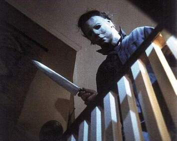
5)In this shot we only see a mask the thing about this is in horror, is that sometimes in slashers the killer has a mask to hide his/her (mainly male) identity away from the audience. This brings in tension and unease because throughout you want to know who the killer is. Some low key lighting put more fear into the shot and make it look much more sinister.
5) With our shot we wanted to make that sort of impression, we used the iconic mask from that of slasher horror movies to give the audience a mystery and unease. There is a dark background and blood on the mask to continue putting an unease to the look of the mask. If you look closely you can see the eyes give a light reflective glare which makes the killer look emotionless even if we can't see his face underneath. The black and white colour scheme goes well here as it compliments the emotionless face with a lack of colour to go with it.
6)In this picture we can see a high angle shot looking over the victims which gives the feel of power to the unknown killer. It is slightly canted which gives the connotation of madness and unease, which is typical in most slasher horror genre movies. Dark environments give the sense of entrapment and no bright lights to resemble freedom.
6)In our shot we have a high angle looking over towards the victim in the distance we make this as if it was through the killers eyes. It is also canted to a great degree which like the other gives a sense of insanity and unease from the killers part. We have motivated lighting coming all around to give the sense of freedom to the upcoming victim this also gives it the feeling of his innocence along with the colour scheme being actual colour to distinguish that he is sane.
7)In this shot we have very little in terms of lighting and we can see the victim, in the background we have a mirror showing the image of something there watching her. Its a good catalyst to bring unease to the audience that they saw it and she didn't as well as a tension build up to a possible scare scene.
7) In our shot we have a mirror reflecting the image of a body being hung up with blood on the torso this shows a sign of torture to the body and it seems lifeless. It gives unease to like the other relating picture because it shows how sick the killer is which is what horror tries to do. We have the colour scheme still there as its in the victims part but we also still wanted it to show that he was still innocent. There is low key lighting and damaged glass with a very grubby texture environment to give a weird atmosphere.
8)In this shot we have a colliding factor with horror daylight torture being shown which goes against horrors typical low key lighting nighttime setting. But it shows the victim tied and powerless to do anything, with blood coming down the face and the face showing a sense of fear towards the situation.
8) In our shot we have a victim tapped to a chair carrying the same helpless concept and is rocking back and forth showing signs of fear and terror inside the victim, it is filmed from the killers eyes which brings in our black and white colour scheme and we can see a light down the bottom to show a connotation of the victims last remaining breathes. A dark and grimy room continues to give a sense of unease about it all.
Finished Movie Magazine

Movie Magazine Research
In this section I will do something similar to that of my poster research and I will get a few magazine covers and see what I believe would be best in order of approaching. I have decided that I would want to make a new issue on an existing magazine rather then make my own.

The first movie magazine I have found is from Empire, I looked through their covers and found two from theirs that are quite different from one another. The first one is with the LOTR cover, in terms of looks it is overall very simply laid out, it had 3 iconic characters from the movie in front of a white cloudy background with write writing and simple fonts and other pictures relating to LOTR. Looking at it, it is quite the busy cover and it could use less writing around it to give it some area to breathe.

The second Empire move magazine cover is quite a bit different in terms of looks and even in style, firstly the fonts are more suitable to its new look. The colour pallet has changed as well going to a more navy blue look and a neon like glow around the people/cast of Sin City, the fonts for the movie are in thick bold writing. To go along with it's theme at the bottom we get a sort of 30mm film strip going along the bottom and in between are some of the features in this issue which gives it a unique look.

This magazine is 'sci-fi now' and it is basically anything relating to sci-fi movies/tv (Also goes along with odd movies such as dark knight etc for examples) so I counted it as a magazine I could use in my research. It is far more bloated with content which drags it away from a visual spectacle, it has far to much writing and this isn't a good thing as you want the magazine to attract the viewers and get to the point on the features in this magazine. A clean white look to it with a picture of a lead lady is a nice front cover on it's own but this one puts a couple pictures in the bottom which kind of makes that area crowded. The fonts are very clear but the amount of writing again is a bit much for a front cover. I need to make sure I don't go along a similar path because as long as you have a attracting picture, the writing will be needed less.

Total film was my next place to find a magazine cover which had another look to it that made it unique.To start off with I found one of recent which involves Avatar, the front cover blends well with theme of the movie with a calm blue background which is a softer colour from the alien race from the movie which allows the image to step out more. The difference about this cover to that of others I have shown is that it has a lot less on (not as less as the Sin City one) but it makes it more welcoming to the human eye. The use of fonts are normal and neat and the colours are a pallet of grey and white allowing them to stand out of the blue. To me this is a great example of a clean and simply effective movie magazine.

The last one I found is from Total film again but this time I found it different due to it actually having very little writing similar to that of the Empire Sin City cover above. But in this case the image is what deals the justice as everyone who loves their movies would know that the image they are seeing means theirs new information regarding it. So just a title and a few words are need and it delivers an eye catching piece. Fonts have gone a little larger this time to cover up the space that more titles would have occupied. A difference here is the use of a poster advertisement in this one on the top above the masterhead which is overly large and this is to grab your attention and to entice you to pick up the magazine. I would want to achieve this but not on such a large scale, but getting a person to buy it is the main outcome and to do that big fonts and gripping pictures are required.

The first movie magazine I have found is from Empire, I looked through their covers and found two from theirs that are quite different from one another. The first one is with the LOTR cover, in terms of looks it is overall very simply laid out, it had 3 iconic characters from the movie in front of a white cloudy background with write writing and simple fonts and other pictures relating to LOTR. Looking at it, it is quite the busy cover and it could use less writing around it to give it some area to breathe.

The second Empire move magazine cover is quite a bit different in terms of looks and even in style, firstly the fonts are more suitable to its new look. The colour pallet has changed as well going to a more navy blue look and a neon like glow around the people/cast of Sin City, the fonts for the movie are in thick bold writing. To go along with it's theme at the bottom we get a sort of 30mm film strip going along the bottom and in between are some of the features in this issue which gives it a unique look.

This magazine is 'sci-fi now' and it is basically anything relating to sci-fi movies/tv (Also goes along with odd movies such as dark knight etc for examples) so I counted it as a magazine I could use in my research. It is far more bloated with content which drags it away from a visual spectacle, it has far to much writing and this isn't a good thing as you want the magazine to attract the viewers and get to the point on the features in this magazine. A clean white look to it with a picture of a lead lady is a nice front cover on it's own but this one puts a couple pictures in the bottom which kind of makes that area crowded. The fonts are very clear but the amount of writing again is a bit much for a front cover. I need to make sure I don't go along a similar path because as long as you have a attracting picture, the writing will be needed less.
Total film was my next place to find a magazine cover which had another look to it that made it unique.To start off with I found one of recent which involves Avatar, the front cover blends well with theme of the movie with a calm blue background which is a softer colour from the alien race from the movie which allows the image to step out more. The difference about this cover to that of others I have shown is that it has a lot less on (not as less as the Sin City one) but it makes it more welcoming to the human eye. The use of fonts are normal and neat and the colours are a pallet of grey and white allowing them to stand out of the blue. To me this is a great example of a clean and simply effective movie magazine.

The last one I found is from Total film again but this time I found it different due to it actually having very little writing similar to that of the Empire Sin City cover above. But in this case the image is what deals the justice as everyone who loves their movies would know that the image they are seeing means theirs new information regarding it. So just a title and a few words are need and it delivers an eye catching piece. Fonts have gone a little larger this time to cover up the space that more titles would have occupied. A difference here is the use of a poster advertisement in this one on the top above the masterhead which is overly large and this is to grab your attention and to entice you to pick up the magazine. I would want to achieve this but not on such a large scale, but getting a person to buy it is the main outcome and to do that big fonts and gripping pictures are required.
Untouchable Finished Horror Poster

This is my finished horror movie trailer poster to go along with the trailer 'Untouchable' the poster only really contains two pictures which are from the killers face and the victims. The layout I done was inspired by that of 'Faceoff' it was a move I saw long ago and remembered the poster and I thought it would be good to give a sense of good vs evil on the poster.
Photoshop was used extensively to help make all the titles and the strapline etc, to get the image as it was I had to darken it a lot and use the burn tool etc this created a dark shadow effect for each side of their faces and I felt brought another layer of fear for it.
Overall I was pleased and thought it brought a strong horror look to it as well as mystery to go along with the teaser and magazine cover.
Poster Research
In this section I have done some research on existing horror movie posters to try and get a feel that would portray our horror teaser trailer well.

This poster comes from Friday the 13th (2009) and in this poster we can see many neat effects that I find appealing and what make it a good poster. First of all we have a pose with the iconic killer Jason from all the previous installments. He is carrying a weapon which in this case is a blade and goes a long with the mise en scene of a killer. The location can be seen as a dark low lit area and he holds a partial silhouette which is typical of the horror genre. But in the case of this poster and of previous installments we can tell that this is the sub genre known as a slasher. What I like about this poster is the fact of the pose showing power and with a mask on to make him a mysterious person.
 This poster is from 'Mirrors' this poster shows different conventions from horror then that of the Friday the 13th Poster. This one shows a girl or what seems to be a girl with some demonic looking state. Not much can be seen of the bottom half of the face but I think this all goes in with the idea of her freakish nature if thats what we the audience are meant to see from this. The most noticeable thing I like about this poster is the use of fonts and the fact that one of the 'R's has been reflected to make it look as it if it were a mirror which I find a very clever idea to go with the movie poster. Besides that the poster is similar to that of others with small fonts and question slogans.
 This poster comes from a recent horror known as 'My Bloody Valentine' which is also a sequel to the original. This poster surprised me more then most over horror trailers because there is a lack of blood to show that it is a horror movie. The posters only indication of being a horror/thriller is the fact of it saying 'bloody' and the fonts are all red. This can also be boosted by the fact we guess that the killers are the miners we see in the poster and they wield weapons in this case a pickaxe. It has some low key lighting But the idea I would like to portray in my poster is the idea of the killer being masked as it is in this one and in the Friday the 13th poster as well.
 This poster is from Eden Lake a new british horror/thriller which has a different idea of a poster comparing it to the others I have researched. As we can the most common convention in the poster is the red writing which gives it that sense of violence or danger. In the background there are four silhouetted people which showers them a more wise and powerful group of people then that of the girl that can be seen behind a tree. They are a mystery to us and the female can gives us the idea of her being the final girl which is common in most horror movies and typical of the horror genre. Low key lighting around the female goes along with more common conventions of horror, the poster gives me a few ideas based around the layout as this is in a landscape orientation.
Using these as some of my research to seeing what is shown on the poster and what rules are applied to give it the overall look and feel of a horror movie. The main conventions I want to portray is the main character being identified, a mystery killer and that black eery surrounding which I believe would give it that horror touch. The slogan also has to be effective as well to entice the audience to go see it or view the teaser.

This poster comes from Friday the 13th (2009) and in this poster we can see many neat effects that I find appealing and what make it a good poster. First of all we have a pose with the iconic killer Jason from all the previous installments. He is carrying a weapon which in this case is a blade and goes a long with the mise en scene of a killer. The location can be seen as a dark low lit area and he holds a partial silhouette which is typical of the horror genre. But in the case of this poster and of previous installments we can tell that this is the sub genre known as a slasher. What I like about this poster is the fact of the pose showing power and with a mask on to make him a mysterious person.


Using these as some of my research to seeing what is shown on the poster and what rules are applied to give it the overall look and feel of a horror movie. The main conventions I want to portray is the main character being identified, a mystery killer and that black eery surrounding which I believe would give it that horror touch. The slogan also has to be effective as well to entice the audience to go see it or view the teaser.


Wednesday, 24 February 2010
Untouchable almost finished cut
This is the groups overall finished teaser trailer which we have called 'Untouchable', we think it holds a good sense of horror but also goes into thriller as well. Not to much blood but enough to understand what a killer does. Compared to others I have seen I think having less blood and more tension is the best way to approach horror because it is only a teaser if you went for tons of gore then you have practically shown everything the movie has to offer. With ours I believe we have wet the appetite of the viewer enough to go see the movie and I think it hits our target audience's needs as well after all the research we done regarding it.
Monday, 22 February 2010
My Audience Research for the horror genre
Gender:

Age:

Would you consider watching a new horror film?:

Are you affected by film advertising? (e.g posters, trailers etc):

Are you influenced by actors, directors, franchise or companies?:

What main elements must a horror film have?:

In your opinion, which of the following is best for the 'evil' in a horror film?:

In your opinion which location makes for the best horror setting?:

Male
The Shining x3
Eden Lake x2
28 Days Later
Frontiers
The Exorcist
Saw x2
Your Mother is so Fat
I Puked in your Food
Friday 13th
Nightmare on Elm Street
Mirrors
The Ring x2
A Haunting in Connecticut
Scary Movie
Battle Royale
females:
Mirrors
Saw x4
Scream
Nightmare on Elm Street
Halloween
Jason X
The Strangers
Creep
Poltergeist
Hostel
High Tension
The Ring
Silence of the Lambs
The Others
Tuesday, 17 November 2009
My Horror Movie Trailer idea
Nightmare at Enorf
Who thought all colleges were great? A young girl, Jody Harper is a shy guy who had moved with her family from Scotland down to the Norfolk area in England. She came in on her first day at Enorf College; a lot of the students tend to give her disgusted looks but the teachers remained happy. Whilst her first day there she saw many students being handled by teachers in a very violent fashion but she continued the day as it didn’t happen. She lives her life as normal and passes each college day, she made a few friends whilst her time there. But still came across aggressive teaching staff along the way.
But as the weeks past she started to see less of the people she once came around to know, at the end of a term Jody left her film class to go to the toilet but on her travels finds a spot of blood on the floor. She follows it and it leads to a room, which she believed was the boiler room. She hears a teacher talking about their method of success by murdering the loose ends that aren’t doing so well by hiding it through bus trip casualties.
Police themselves have been investigating these odd occurrences of murder within a short period of time. But there are no connections with any of the many deaths and disappearances of the missing kids even the police force lost men when visiting the college in asking of questions. They lay suspicious.
She takes time over a couple days hiding the fact she found out that the college murders students who don’t do well and hide up their deaths. She is in dangerous territory herself as she isn’t an over great student, she is being hunted by the college. And the world needs to know the massacre the college is up to. As an attempt to call the police one of her friends were killed off in a sign of warning and for her to live her life like she never discovered anything.
Jody eventually looses her mind and stands to fight these serial killing teachers with brute force. Gore and bloodshed await the victims but is it Jody to be next?
Monday, 16 November 2009
Horror Genre Mood Board
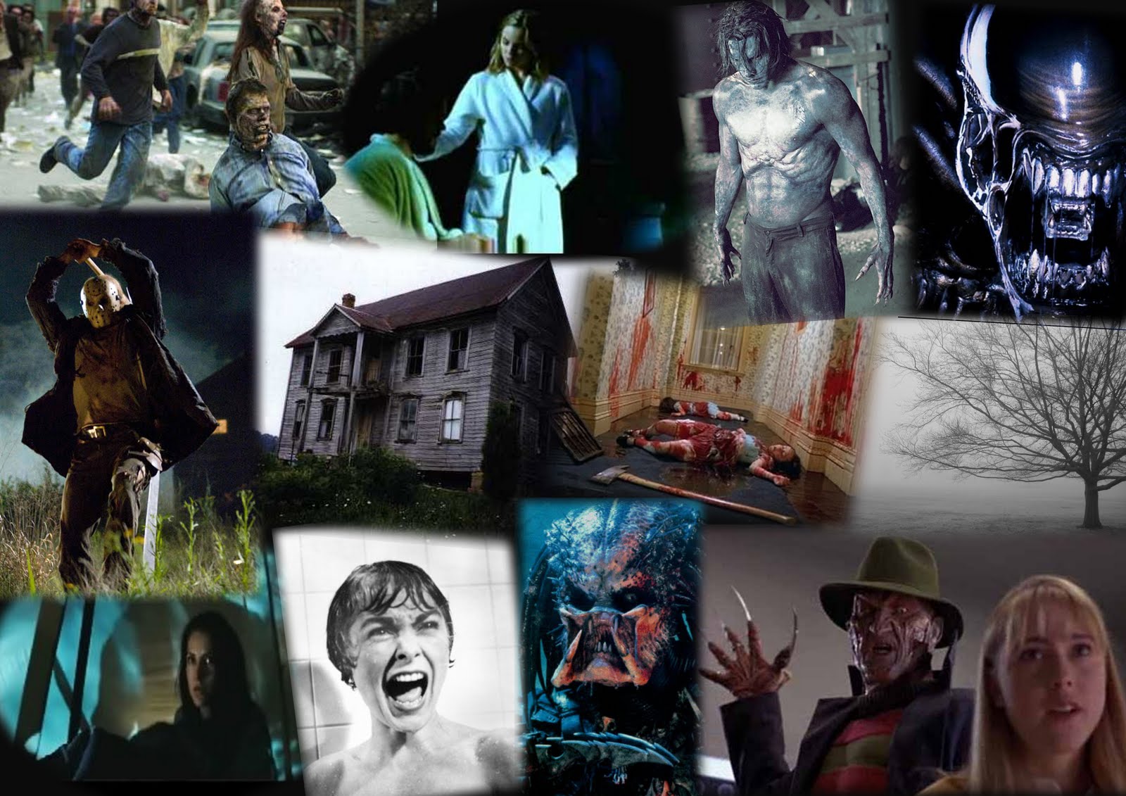 This is my Horror Movie Mood Board, in what you can see here. This is what I would like to see (idea wise) to be shown in my teaser trailer when we go into production. The ideas of a masked or indeed crazy man/thing I think this goes well with todays horrors such as Friday the 13th, Halloween remakes etc. They hold a very mysterious quality that attracts audiences and teases them to want to know more about who is behind that mask.
An eery location is something common as well and if I could I would like to continue that sort of concept or maybe update it a bit and twist it around. If this can't be done then it would have to be a dark grimy location to give the sense of disgust etc.
I would possibly like a female lead as men just don't hold the right characteristics for horror, when they are in it they tend to be the killer rather then victim but if they are they die very quickly. The idea of a final girl is what is common in most horrors and well as it is a way to go I may think about it differently maybe having two but which one really is the final girl and twist the audience. But down to group discussion and situations a boy is most likely to be the victim.


Key Conventions of the Horror Genre
There are many conventions that create the horror genre as a whole, but over time there have been specific conventions that are now passed onto each new horror film. One of the main conventions, which will occur, is to do with the location of where it is, normally this could be a haunted house or an isolated area (Eden Lake). Or if it is like ‘Halloween’ it could be a suburbia estate. These types of locations are the most popular across the genre of Horror.

In several films like ‘Eden Lake’ or ‘The Shining’ the audience are placed in isolated environments, which will bring you the feeling of an approachable danger. To go with the idea of the setting of the Horror movie, the places may have a past connection with the main killer or hunter. Why this usually happens is because something in their lives happened there and the new hero has either moved in or been there at some point in time. This is mainly a tool used in a way of creating twists within the story and is used quite regularly. Halloween set itself in a suburban area and the event was to do with the house he had lived in as a kid (The killer that is). Over time after he was put to prison, you see the house is still there and remains untouched due to its past history. Residents occupy every other house besides that, but it seems very quiet and peaceful. But like we say about locations, peaceful goes well with horror you don’t hear the killer coming.
 Horror movies always have lighting to their advantage, how do you make it scary? Well if you take films like Halloween and Friday the 13th, the lighting plays the biggest part. This is down to it being very low-key lighting; there are hints of light that normally comes from things like the moon or a torch but all this plays towards the scariness of the movie. For us it sheds some light towards the final girl or hero for them to believe they can escape from wherever they are. But as were watching the audience feel like that there is going to be something coming out of somewhere and it puts some suspense and questioning where the killer or villain will strike. Movies that use lighting to its advantage is films like Halloween, the idea is it’s late at night and the killer is hiding within the shadows.
While watching ‘Halloween’ the lighting is what made the movie as good as it was, you had the teenagers having sex and it pans around and in the shadows you see the shape of a face just starring at them. And it’s that sort of idea that makes it terrifying and you yourself are on the edge of your seat. Early dated films such as Nosferatu used lighting to achieve fear like the shadows of the vampire appearing large on the walls to show power of this creature.
The next convention which sometimes the audience while watching it are unaware of are the amount of close ups throughout the film. Halloween is a good example of this; the main character is normally having a close up of her face when she believed she had been seeing things in the distance. This is what she felt was there, this is carried on throughout the film showing her fear when she comes across the people she know that are dead as well as being chased by the main killer.
You got many close ups of the killer as he killed his victims in the film, but as he was wearing a mask you couldn’t see his emotions but by the close up of the non-serious mask. It showed that he honestly didn’t care what happened and was just going to continue like nothing happened. When we get to the fighting parts close ups are what are mainly shown, especially of the main character. It shows her being scared and confused on what to do and this made the audience feel discomfort etc.
 Besides the occurrence of Close ups there is often a couple Extreme Close Ups (ECU) in Halloween and normally any other Horror Movie the reason for it is that when there is an ECU on the victim (Final Girl or Hero of Male gender) to allow us as the audience to identify with terror. The other purpose of it that keeps the tension is that if we only see an eye or a mouth of the victim we have lost location of the killer and we are more tensed wondering where he/it will be next.
Horror itself uses these close ups to bring the tension to the screen, along with close ups the viewer may come across point of view shots. These shots are present in Halloween also where the main character believes she is seeing this guy that has been following her in the distance but in the end isn’t but after the walk away you see it from the killer’s view.
No matter what film you may see there are always multiple amounts of camera angles. But in Horror they are different to the extent on how they’re shown. Camera Angles play a big role in the way of terror, for example in both Halloween and The shining, low camera angles were laid on the heroes to show a sense of helpless at the hands of the killer. This was the opposite for the killer normally it would be a high angle to show their power over the Hero etc. But this isn’t always true as it can switch depending on the situation that occurs between the two.
The most popular in camera work is the canted camera effect, which is used in some Horrors, the camera is more on a slant, which makes the image seem a little more disorientated. But that type of effect compliments the Horror Genre, you could say it was used in the early days in ‘The Cabinet of Dr Caligari’ German Expressionism 1930.
The next popular thing to find especially in slasher movies is a weapon of some kind that the killer uses. Halloween, Eden Lake and The Shining all use blunt weapons such as a knife or axes. Other films like Final Destination go for environmental killings and Saw for twisted games.
Halloween itself was the beginning of the sub-genre the slasher movie. It begun the use of a blade in this case a kitchen knife as his weapon of choice, as time went on a change in weaponry came about. Nightmare on Elm Street had Freddy the killer have knifes on each finger. If the knife or blunt weapon were disarmed the killer would use the environment such as a telephone line (Halloween) or any other dangerous killing option to murder the victims.
 Moving onto the victims or the characters in the Horror movies, the most common of all would be the average teenager. From slasher movies to general Horror movies, teenagers are used as the main character as well as the victims. The reason for this is that the target audience for Horror movies are now the teenage/young adult audience. So to immerse that type of audience you need characters of similar age to feel a connection between the two.
Whenever we cross teenagers in horror movies they tend to be reckless people who are normally having drinks, sex and anything else of the sort. Films that show this are ‘Eden’ Lake and ‘Halloween’ from what we have studied. They tend to be killed due to them being reckless and stupid in the movie.
Halloween is an example of teenagers as the main characters, each one is killed off and it lead up to a female character. The female Laura was a virgin and this carries along through most of those types of films, she tends to also be slightly masculine. In this case she was a babysitter and was quite mature amongst her other girl mates. Other films like Final Destination 3 took a female as the final girl who was also to the same description as Laura from Halloween.
Besides the main hero often being female, law enforcement tends to be ineffectual. In Halloween they are laid back and refuse to believe the doctors that a killer is on the loose down to it being Halloween. Horror films make law enforcers less caring then reality, they make the main hero believe it is a joke till they themselves later discover it was actually true.
Besides the main hero often being female, law enforcement tends to be ineffectual. In Halloween they are laid back and refuse to believe the doctors that a killer is on the loose down to it being Halloween. Horror films make law enforcers less caring then reality, they make the main hero believe it is a joke till they themselves later discover it was actually true.
Horror usually has a theme of some sort of theme, we studied that they expanded into many different themes. Back in the early 50/60’s it was to do with monsters within us (Cat people, Werewolf), or mutation. Evil scientists were common as well like Jeckel and Hide and Frankenstein. To the current day and theme of horror it has moved into the path of the psychopath. Friday the 13th, Halloween (Remakes), Nightmare on Elm Street etc is the most common of all. The other type of horror is now the torture porn series of Saw, the all have the same style but adapted in small ways. We the audience should know what to expect from each if we are told what the film is called and the genre of horror it is. I think these conventions are what make the Horror Genre what it is.
Monday, 9 November 2009
Marketing Plan
Complementing the distribution plan, every film must have a detailed marketing plan, the point of a marketing plan is very simple.
-Raise Awareness
-Engage Interest
-Create visibility
Posters:
This is basically the main image of the film, it normally will give its stars, genre, cast and maybe the odd tagline which may send a question to the audience. There is normally more then one version of the poster, each one may show a different cast member or a different aspect to their film so each one on it's own has to stand out against the rest.
The posters may be created by the studio themselves or a sales agent, these are then rolled out over the globe or changed to suit locally. In terms of the UK they may have originally been devised here from scratch depending on approved materials and how the film is best presented.

The most popular poster would be the teaser poster, the idea behind a teaser poster is the same of a teaser trailer, it is meant for the audience to look at it and want to know what it is. Genre and that are normally strictly hidden or will unveil very minor details to the whole film.
Trailers:
Trailers and Teaser Trailers may be the single most cost effective part of the marketing plan in general. But these can be boosted by the fact they are played on the big screen to try and captivate an audience. Main trailers tend to appear not long before the actual release of the film however, teaser trailers are shown a couple months in advance. Teaser trailers tend to be short revealing very little information but may spill some bits such as cast or genre. The tend to be between 30-90 seconds in length and are basically aimed at making the audience want more.
A successful teaser is one that can get an entire audience disappointed because they wanted more to be shown. Trailers are made by specialist agencies or production companies to make it with the available material from the movie. Most trailers give you a variety of shots from the movie, to get some attention they may put some of the best bits in it as well to bring more anticipation from the audience. Material can be short as maybe most shots have not been filmed yet, so they try to make in engaging off what they have.
More then 3000 copies of a theatrical or teaser trailer are sent around, they tend to be shown in screens that are viewing films of similar interest. Some trailers for upcoming movies get shown on DVD's of similar interest as well, it isn't as common but is a possible way of doing it. The most common way is trailers being shown online, it is by far the more common of the lot.

Online:
Most successful planned movies tend to get more then just a poster and a trailer or two. A website is normally the next step to get people who like the internet to be interested in their website. The website is normally like a teaser site, which contains the trailer and maybe some brief news that has been going on with the movie. The also may contain mini-games depending on the audience they want. Galleries/stills will also be available and even behind the scene footage may be shown to the online community.The may sometimes give the audience blogs from the set and other content like video blogs or snippets from the set entice the audience more into their movie. Film clips are actually the most searched for content on the internet.

Merchandising:
Many releasing films, mainly family orientated films have merchandising laid out for the public. Normally it would be an image or logo relating to the movie put onto different merchandise. Examples of this are figures, clothing, ringtones, screen-savers or anything else to be honest. Even food outlets release toys for kids in their happy meals etc, this is normally for kids movies or other related content. But it means more people can know what their movie is, merchandise is a big thing in the marketing plan. Take Star Wars for example the amount of merchandise that has shipped in it's life span is a phenomenon on it's own.
Distribution Planning
This is one of the things we were asked to write about on this blog and I am going to narrow it into small points.

-Film Distributors have to first consider what the film may earn in terms of low/mid/high estimates, once this is taken into consideration then an overall budget can be made including all related costs. The obvious idea is that they want to make more money then what they have thrown in, sometimes this isn't achieved.
-The Audience is the next big thing to take into mind, they need to know the age/gender/group even lifestyle etc to find if they would appeal to the movie. But normally they look of films that relate to the film their distributing to get a vague idea on the audience.
-Most popular audience age group is 15-24 year olds, they visit the cinema at least once a month and possibly more.
-Normally test screenings are shown to small groups of audiences, these tend not to be the full film but they give them questionnaires as well to fill in. This can give the distributors what to expect on the broader box office audience. 'Sleeper' Hits tend to be more common now, they are on for a more longer time and earn more then expected.
-The competition can become very different you have many different types of films that they have to take into consideration before they know when to release theirs. It may conflict with a film of similar genre or audience age group.
-Is it an event driven film? or a summer Blockbuster? or a specialized movie for a more discrete audience. Is there any star power (Famous Actors), do they appeal to the audience if they were in any previous films? Is the Director or Producer well known, do people like their work?
-Any hopes for the film to get an Oscar or award nomination
-Is it a sequel or a franchise entry, what makes this one any different or better then the previous installments. And will it be a big enough change to attract its old audience due to it be released again.
-Digital Regeneration allows a new way of distributing their movies over to cinemas to show audiences. The most common way is by 35mm celluloid prints, this is still going on but the future is known to be digital or on disc. The statistics behind it say that doing it via a digital medium the costs globally to companies is 10% cheaper which in their eyes is a big margin of money.
The backfire to this, is that most UK cinemas or even America cinemas still haven't fully digitized themselves. Another benefit to being digital is digitally remastering although time consuming, bringing old movies back to life. Whilst being digital they won't deteriorate over time unlike the 35mm.
Subscribe to:
Comments (Atom)